Western Digital MyBook
I was nearing the storage capacity of my 4TB external hard drive, so I figured it was time for an upgrade.
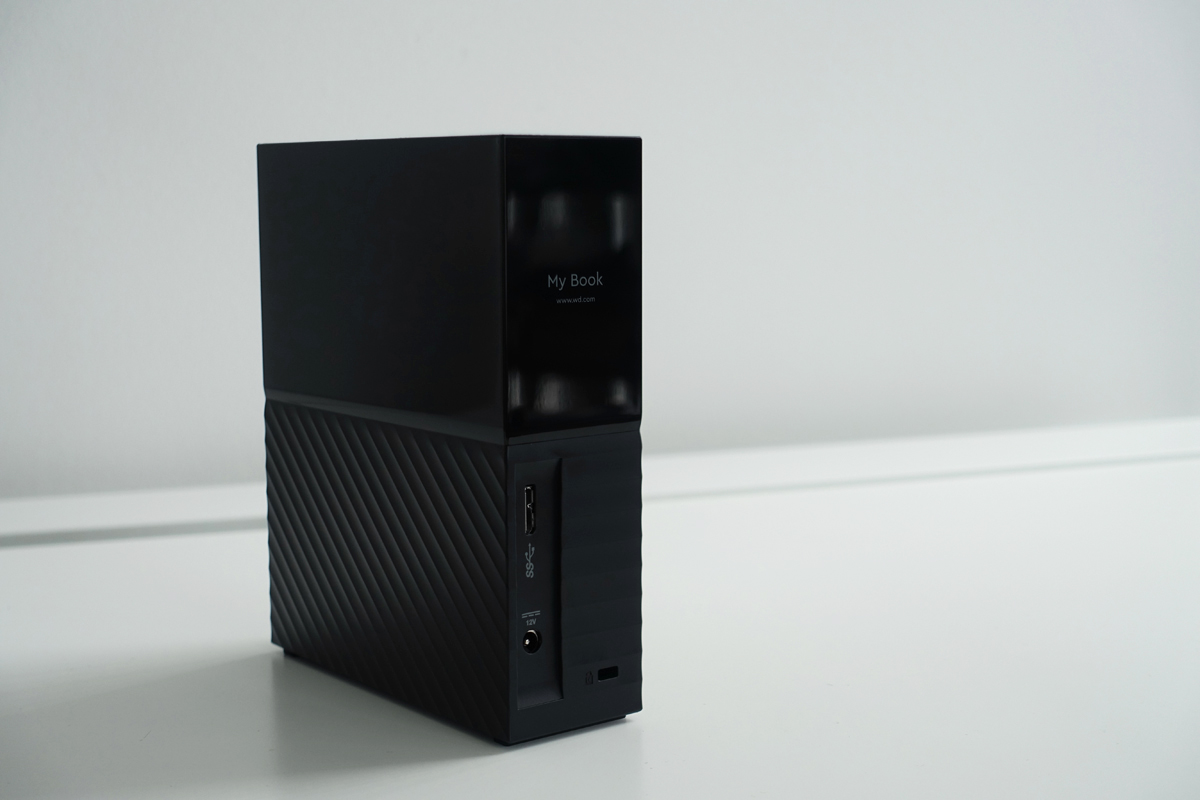
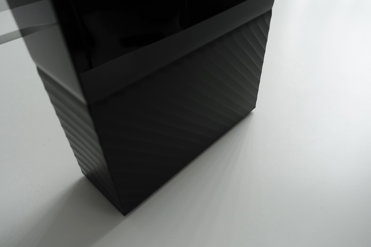
Regardless of performance, I pretty much picked this out because of how beautiful it looks. Western Digital worked with Yves Béhar's fuseproject to design the look of this hard drive.
“the bottom half represents our physical world – grounded, rich with texture, dynamic. The top is meant to be our digital lives – clean, pure, simple.”
The unboxing experience.
An absolutely miniscule 2pt font size for the instruction manual. "Read these instructions. Keep these instructions. Heed all warnings. Follow all instructions." Very helpful.
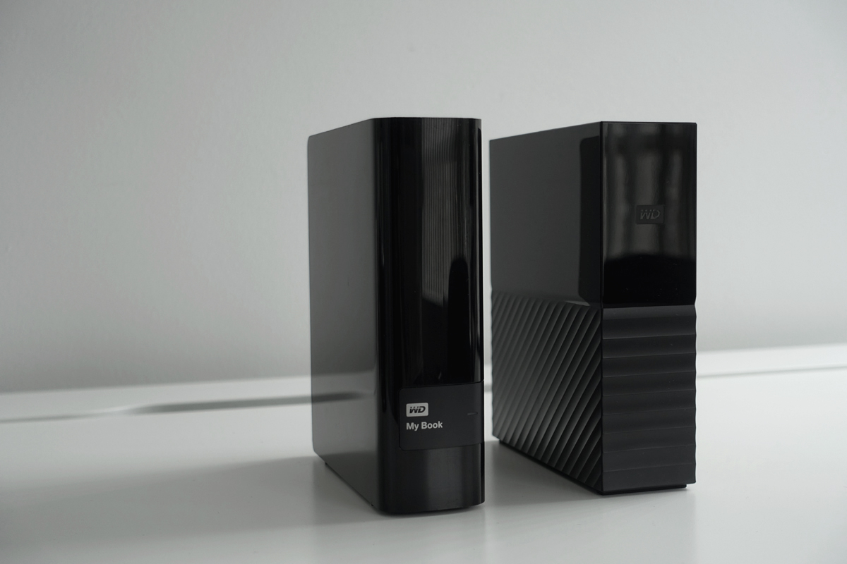
Old and new. This latest My Book is a very big departure from the WD hard drives of the past, which were all much rounder. I'm a big fan of this new aesthetic though. And finally with two hard drives I can be rest assured I have at least one additional layer of redundancy in case anything goes wrong.


