GradEx 104 | 01
01 | Overview
My school, the Ontario College of Art and Design University (OCAD U for short) has a graduate exhibition that encompasses the entire school, showcasing graduating work from every program, spread across several buildings. It’s so massive you’d have to make a very deliberate effort to really see everything. I’m splitting my thoughts about it across several posts, though it’ll mostly be about my own program, Industrial Design. This is part 1.
This year’s GradEx was a bigger occasion for me than usual because I had to go out of my way and fly back in order to see it. I’m still not graduating this year, but pretty much the rest of my friends are. Honestly, this also made it really hard to write this post since I knew so many of the students personally. I also attended a lot of the Fall semester thesis critiques so some of my thoughts are coloured by what I saw of their process and not just the final results.
Although this is the 7th GradEx I’ve attended (been to every one since 2013) this my first time writing about one.
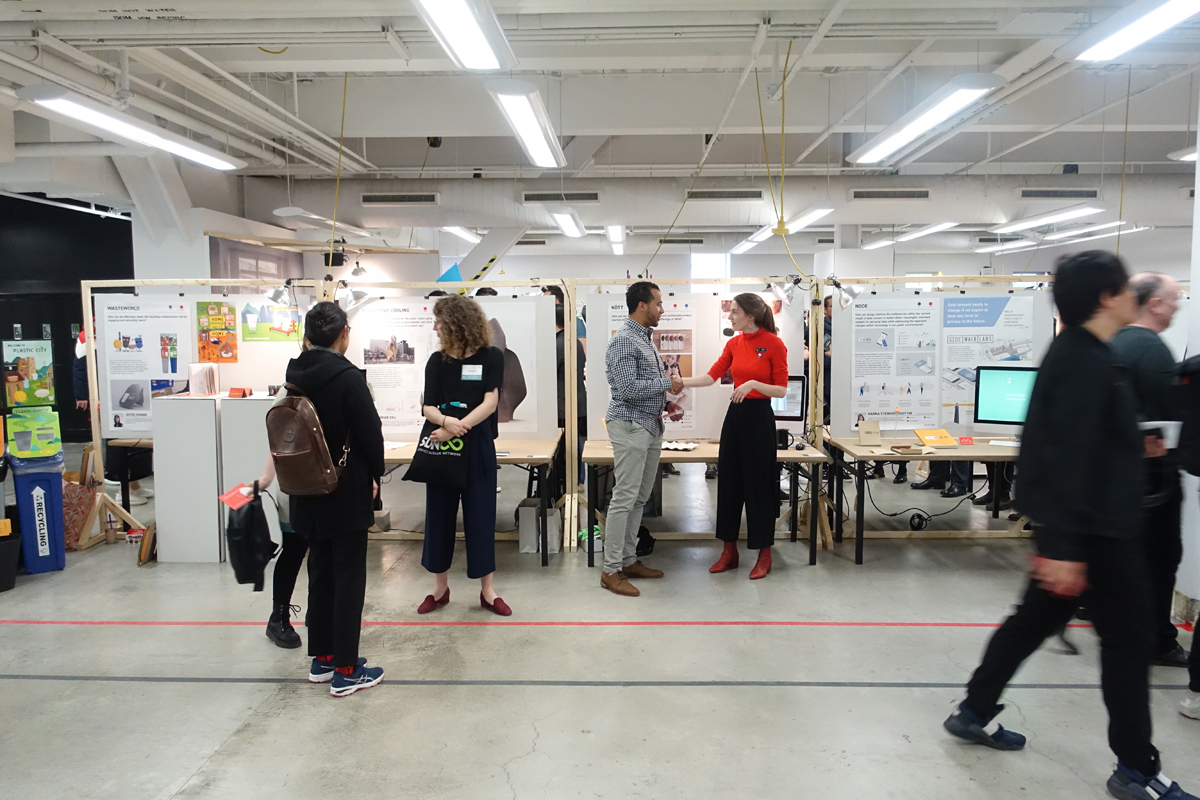
I can’t speak for every program at the school, but at least for the Industrial Design program the graduating students are responsible for organizing and arranging the entire set up of the given space (we share about half the 5th floor with Environmental Design). You can see it split with the black taped line above, with ED on the left and ID on the right.
These signs were ID student created too. It depends on the year, but the ones this year have a certain, uh, home made look to them.
Each year the students are also responsible for creating their own branding. This year’s logo development was led by Simran Dadlani & Clara Wu, while the spicy animation above was created by Domenic Violante. There’s also a site with a collection of all the work from this year’s students.
I liked the core branding but it hasn’t translated well throughout the entire space.
That means there’s more room for each individual project to assert its identity, but it also means the rest of the space around it looks rather empty.
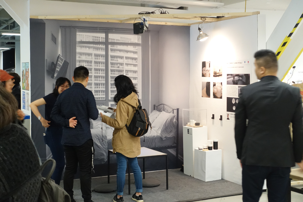
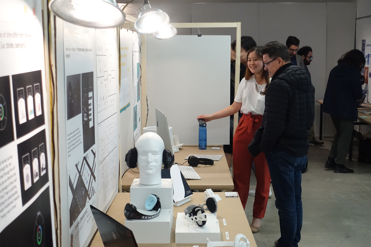
What the graduates get to do for five days in a row is stand and talk about their projects.
And there was a lot of it.
I think it’s actually a great way to refine your elevator pitch, because you can AB test so many statements eventually you find one that sticks and resonates with the most people.
Never miss a good chance to plug some of your other work in a thesis display.
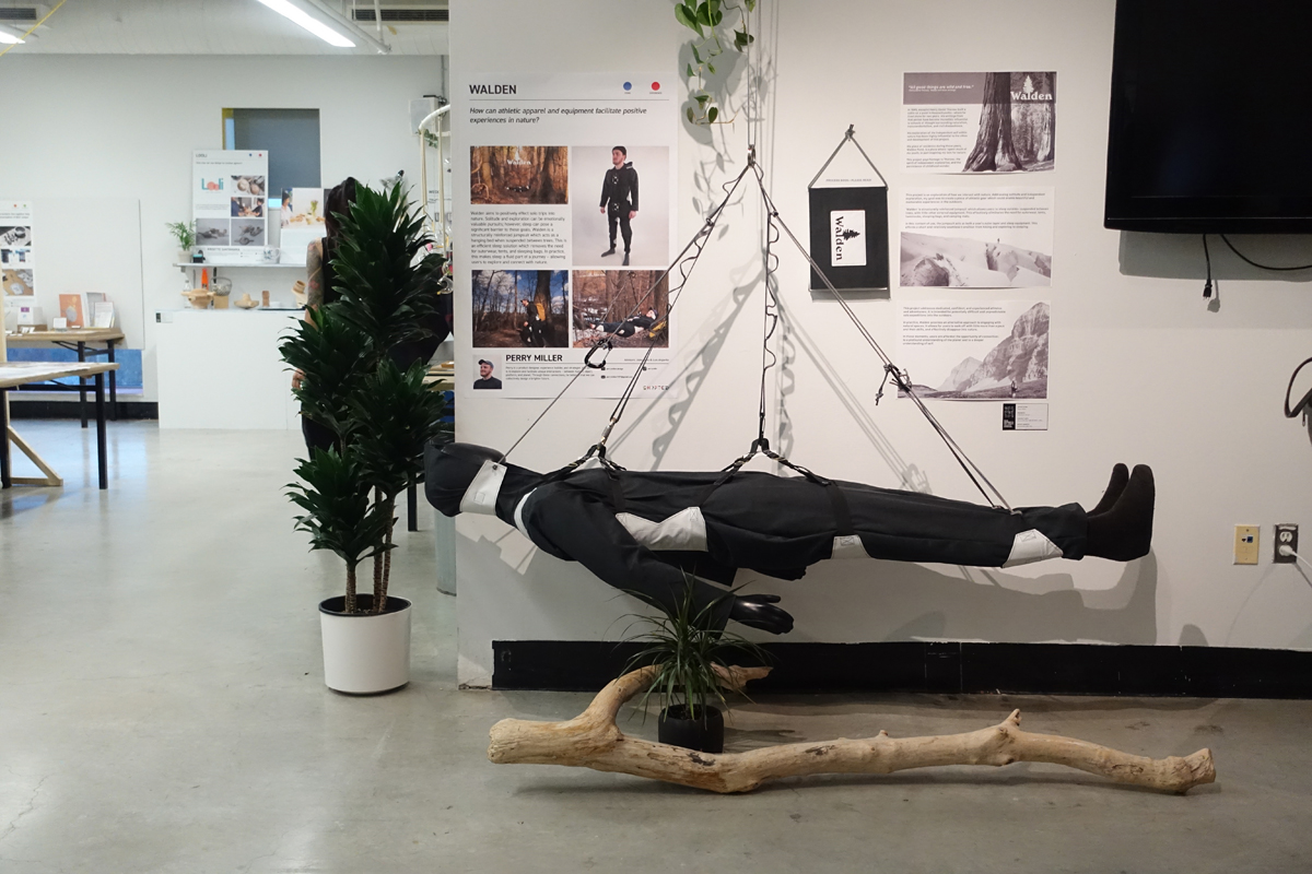
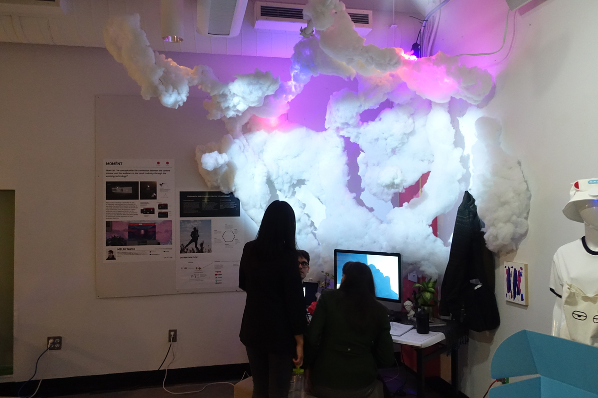
If there’s one thing I can say about OCAD’s ID program that sets us apart from other schools, it’s that our projects can end up being pretty wild. There are a lot of strategic, speculative, and critical design work to be seen in addition to ones that are constrained by commercial viability.
Yeah, this drew a lot of eyes.
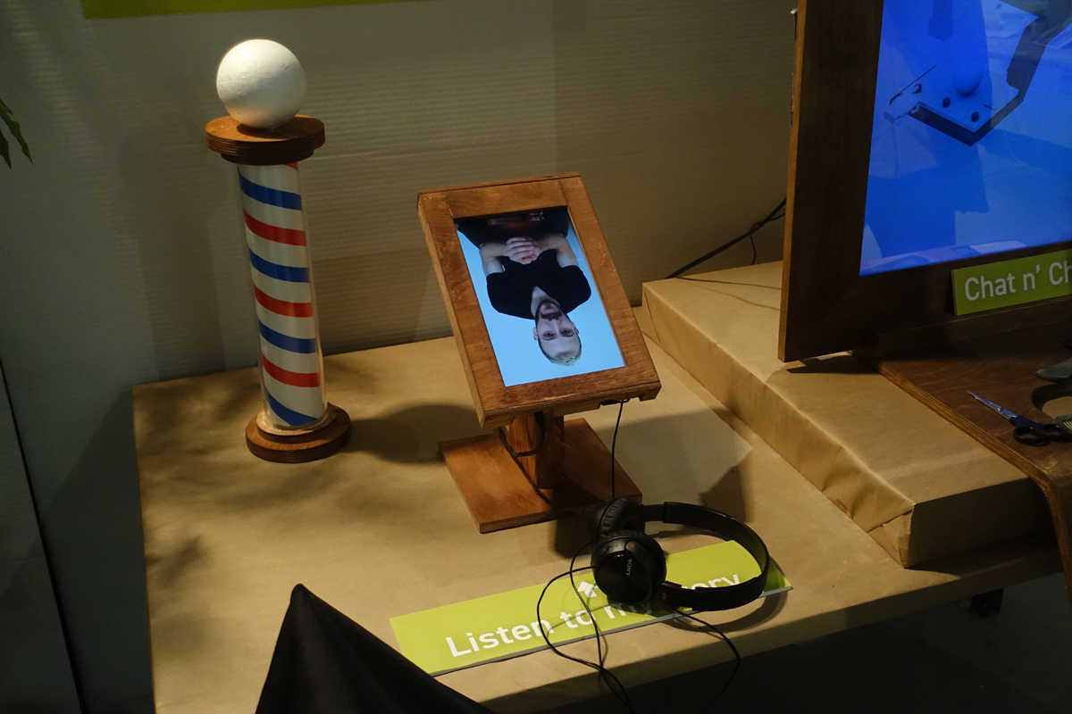
I actually thought this was flipped on purpose at first, until one of the grads went to fix it and turn it back right side up. I wouldn’t put it past an OCAD student.
Relatable.
Where we lack in the development of hard skills such as sketching, form development, CAD modelling, and rendering, we make up for in variety. And research too I guess. Unlike some other schools where sexy renders and hot sketches are the main focus of the display posters, here it’s very much on showcasing just the core concept.
Congratulations to everyone who finished! I’ll go over the details of some of the projects that stood out to me in part 2.


