YSDN: The Intermission
A friend of mine suggested I drop by so I decided to check it out.
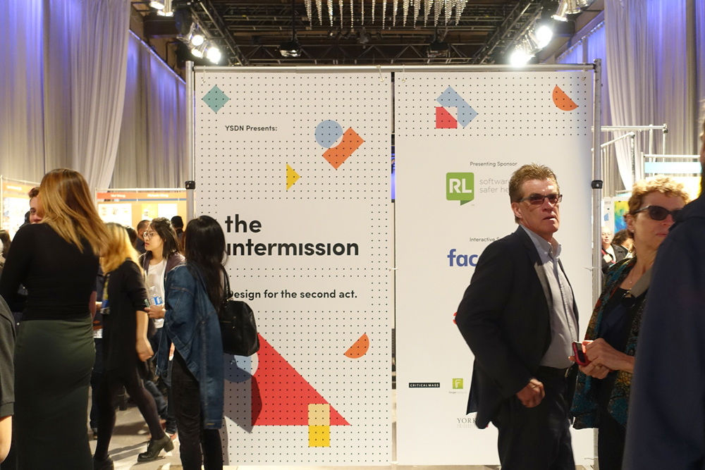
I fell in love with their branding almost right away. I'm a bit of a sucker for grids and regular geometric shapes.
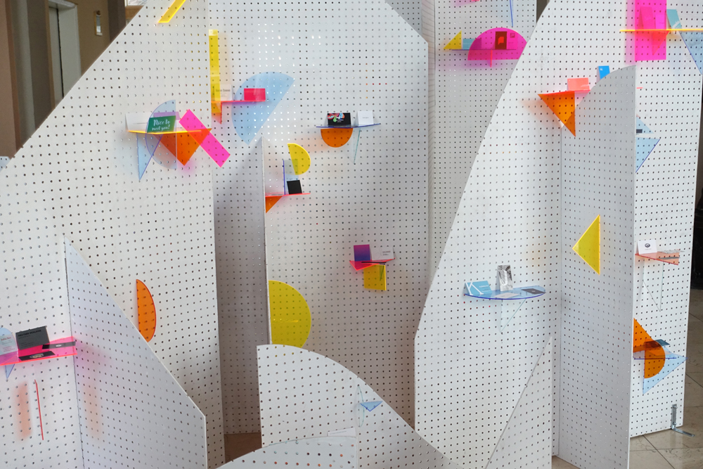
What I found particularly impressive was how well they transitioned their trendy digital branding into reality, with the pegboard matching their dot grid and stickers to recreate their text and shapes.
Always nice to have a real equivalent to ephemeral digital creations. Skeumorphism comes to mind, except it goes the other way around. But I digress.
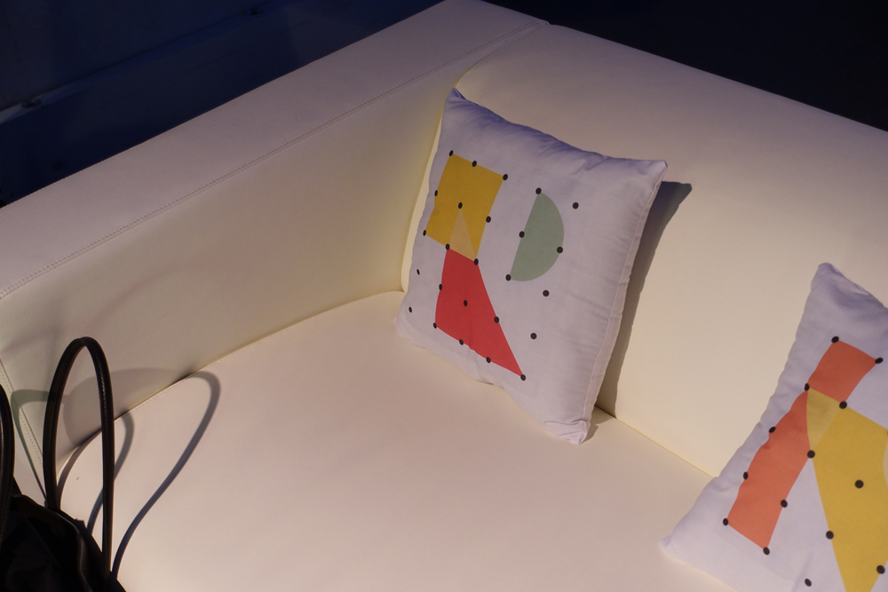
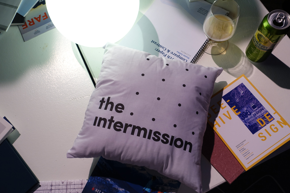
They even branded their pillows. These guys really get me. I loved these.
And you can even find it on their popcorn. Score.
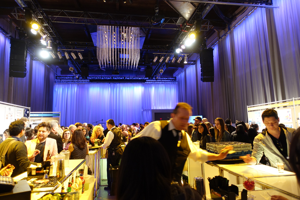
The Liberty Grand sure lends itself as an impressive backdrop to a momentous occasion.
I'm glad by chance I met up with a few OCAD graphic design and illustration grad soon-to-bes to help me make sense of the show. You can recognize good work when you see it though.
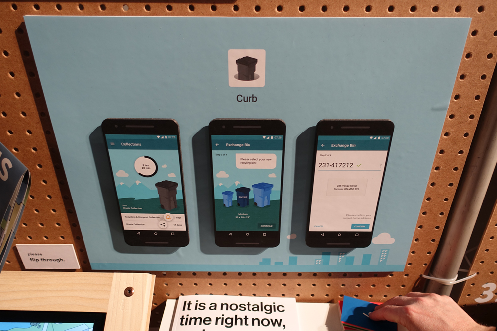
Material design is a big plus for me. Really liked how Google spearheaded that as a design standard and metaphor. This grad would've totally killed it if he recreated the layered metaphor physically in this display. The drop shadows are nice, even if they weren't intentional.
Always seems to be a problem at grad shows. Especially for the visitors that like to "collect them all". Business cards aren't Pokemon folks.
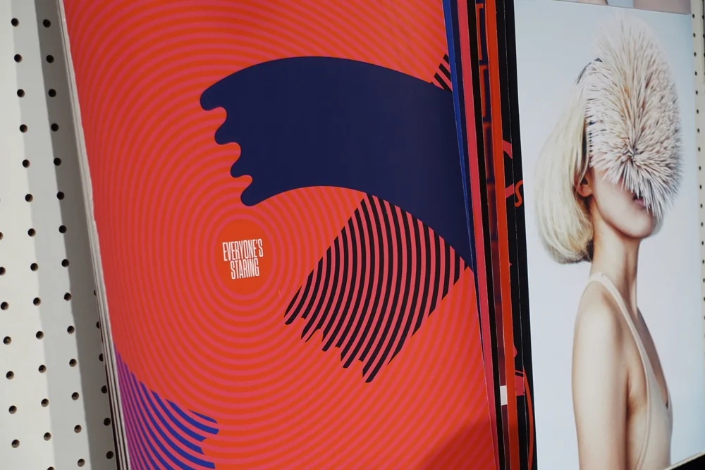
Lines and squiggles. Very now.
Not pointing any fingers, but I always cringe a little when I see pixelation in images. This isn't just at the Intermission though, OCAD, and even other schools are guilty of this too. Step up your game guys!
It was bearable, but the only downside to this venue hall was that some sections were incredibly cramped. Ingenious use of binder clips and string though from this set of grads.
That about wraps it up for the night.
